Skip to Navigation | Skip to Content

Class Blog

Monday, April 26, 2010

Design exploration: wendysrealtime.com


The current slogan of Wendy's, the fast-food restaurant chain, is "You Know When It's Real." Pair that slogan with Wendy's addition of the as-it-happens appeal of social media and you have www.wendysrealtime.com. As site creator Eric Wagliardo puts it," the site is a hub for Wendy's Social Media campaigns, so there are paid promotions on YouTube, FaceBook and Twitter. We wanted a way to tie everything together into a nice package."

Even if you aren't a Wendy's fan, the concept of the site and its offerings keep the user engaged. The first thing users see is a 3D effect on how tweets appear. The constant movement is "fresh," like Wendy's food.

Here's a official description of the site: "In a virtual world that changes by the second, Wendy’s Real Time gives visitors the chance to watch the present moment unfold before their eyes. With live feeds from Twitter, YouTube and Flickr, it reports what the world is saying right now about what’s real and what’s fresh, including Wendy’s."

So you, the user, can tweet about Wendy's or submit photos or videos and see them pop up on the site.

Tired of the tweets? Wait for the interactive games to show up like "Ice Patty Hockey" or "Ice Burg Attack."

Read Fresh Facts or for hilarious fun, check out the videos submitted by contest entrants on http://www.youtube.com/wendys. The 7th entry in the Winners field — drive-thru rap — is my favorite. Entrants had to submit a video of themselves having some sort of Wendy's moment to win a year's worth of Wendy's hamburgers in Wendy's 30 Seconds of Wendy's Video Contest.

The concept for the site — a culmination of branding and a social community platform — is at the very least current given the popularity of social media. Ordering online now seems so "yesterday."
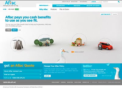
Design Exploration: Aflac.com

Aflac, (American Family Life Assurance Company of Columbus) a leading provider of supplemental insurance, had low brand awareness and confusion about what separated it from other companies. So 10 years ago, it hired New York-based Kaplan Thaler Group — www.kaplanthaler.com — an ad agency to help break through this barrier. The result was an irreverent, irascible duck so memorable that is has become an iconic character much like the Energizer Bunny.

Despite a successful early brand awareness campaign, some consumers still weren't sure what Aflac was actually selling. The TV commercials were amusing, but the product got lost in the action.

So in 2009, Aflac hired Firstborn — www.firstbornmultimedia.com — a New York multimedia agency, to redesign Aflac.com. The goal was to provide users a clear understanding of what the duck represents. During the concept process, Firstborn realized that the basic facts about Aflac were their most powerful marketing tool. For example, the fact that Aflac pays you cash benefits to use however you want distinguishes the brand from competitors. To better reflect Aflac's offerings, Firstborn carefully created one vignette for each fact so the appropriate information would be communicated to each audience through engaging animation, interactivity and the Aflac duck himself, who would guide the user through the entire experience.

In January 2010, the entertaining and educational interactive site was unveiled. The revamped Web site now features an intuitive organizational structure, with sections tailored to the needs of consumers, business decision-makers, brokers, and prospective agents.

Each section of www.aflac.com encourages visitor participation as users click through and advance to the next page. In addition to the tools and information found within the site, the Home page provides visitors with the opportunity to manage their own accounts, connect to and interact with the Aflac duck on Facebook and Twitter, find an agent, and obtain claim forms.

After engaging in the site, users should now know exactly how Aflac can work for them.


Also, Aflac boasts an engaging site called www.youdontknowquack.com that poses trivia questions combined with cartoon-type graphics and fun sound effects. The idea is that if you only associate the duck with Aflac, then "You Don't Know Quack" and need to visit the site. This back-to-basics approach goes beyond branding and provides potential customers a clear-cut message on which to act.

Wednesday, April 14, 2010

Website: "Repo! The Genetic Opera"


Repo! The Genetic Opera is a Rock Opera film directed by Darren Lynn Bousman adapted from the original play production written by Darren Smith and Terrance Zdunich.

The film version has become the "spiritual" successor to the Rocky Horror Picture Show, it seems.

The premise of the play and the subsequent 2008 film is a severely dystopian world where organ transplants are commonplace and easy, just don't ask who had the organ before you. Organ transplants may be easy but, the payments are not. Those who default on a single payment get a visit from the Repo Man and his leather bag of sharp objects. He will repossess that organ and leave your now debt-free corpse where he found you.


Anyway, this is not a film review, I'm here to talk about the film's Flash website.


Warning: Some of the imagery may be disturbing. You have been warned. The film is rated R for violence, sex, drugs, and surgical addiction. The website is around the PG-13 range.


The website would not have been terribly compelling without Flash.


The Flash website captures the colorfully grim feel of the film very well while keeping the productions stage origins intact (recurring stage/stage-poster themes, etc.). The prominent feature buttons slide out like morgue stretchers. The footer navigation bar has a solemn headstone feel. The background of the main navigation page is particularly interesting with the floating billboards (I'm assuming the spotlight directions are randomly generated).


However, some elements of the site could use some work.


This is defiantly an interface where Function picked up Form at a bar and woke up in a bathtub full of bloody ice the next morning. Many of the sub-menus take you away from the main page without an obvious method of return. The "kill the sound, please" button is clever but, not "loud" enough (it is the small megaphone in the upper-right corner).

The site was designed by Wiretree (their site would be worthy of a blog entry itself).

Wednesday, April 7, 2010

F_Files.com and SmartBuilder.com

Ffilies.com

Ffiles.com is a Flash resource that I discovered. I like the fact that in addition to showcasing innovative Flash programming they allow you download the source files. This really allows you dive into some really cool stuff and try and incorporate it into your own work.

3D Interface

To the left is a screen capture of a 3d looking interface. I find the examples of interfaces and interactive menus to be the most compelling and useful. I mean its great to recreate the Aura Borelasis but really how useful is that?
I have found some great interface ideas here with the ActionScript programming to back them up.


Radial Dynamic Menu


Here is really cool radial menu idea. This is a good bare bones example ripe for further experimentation to really make it your own. I like how each design is done in a simplified way to allow foe designers to use the general idea but to customize it with there own unique take. It is great that talented designers will publish for free their work here.


Dynamic Text Collapse

On the left is another example I found from this site where through programming you can have a set block of text animate out with a super cool falling effect. This is an example of something that I wanted to do but when thinking about the logistics about creating each word as a separate movie clip and then having to animate then in a convincing way became dismayed and ended up moving in another direction. If I knew about this site I could have looked into using this example to programmatically accomplish this same feat.


XML Flash Image Gallery Another cool thing I found on this site is a fully customizable XML Flash based photo gallery. It allows you to fully customize all of the parameters and then use the numbers and setting you prefer in the scripting to make the rotating image gallery exactly how you would like it. This and many of the shared resources on this site are an invaluable tool to designers looking to learn and share their skills with others. It is amazing that all it takes is the desire and the follow through to break apart these great examples and make something that can truly amaze.


SmartBuilder This is the main product of the company that I now work for. They have developed a WYSIWYG interface shell to develop fully robust and customizable e-learning content that leverages Flash. The program is basically an advanced Flash application that allows click and configure scripting. With SmartBuilder it is possible to create content that has fully customizable interactive features and can be simple to develop. I would love to know more about its back end but it can accomplish some truly amazing things in relative ease. Any object that you create can have actions added to it with total ease. Text can be changed dynamically images can animate in and out with fully customizable effects. Also since you can import .flv files directly anything that you can't do in Smart Builder can just be created in Flash and added. Its ability to write script through simple clicking is amazing. Drag and drop testing. Simple as a few clicks. Timeline to animate in multiple objects. They could be text, images, .flv files, audio. Its features are simple to use and yet have the same sort of unlimited possibilities that Flash itself has. Tests can be created easily to test correctness and score and can have full interactivity within. This is an amazing way that some talented Flash designers have created a whole new universe of usability and yet it is still just a Flash file.

Monday, April 5, 2010

Amanita Design


Amanita Design is an independent video game developing company based in the Czech Republic. It was founded in 2003 by Jakub Dvorsky and since its inception, the company has produced award winning video games, educational and advertising mini games, websites, a short film, animations, and music videos all using Adobe Flash.

Point and Click Adventure Games
Amanita is probably best known for their classic point and click adventure games which have a distinct, whimsical feel. These games are incredibly enticing to say the least. Their lure probably has something to do with their lighthearted style, comical characters, surreal puzzles, and engaging environments. Plus the soundtrack and event sounds add just the right atmosphere without dominating the play. There is also a nice blend of organic/nature inspired elements and animations contrasted against the corroded machine-like buildings and interiors.

While studying Animated Film at the Academy of Art in Prague Dvorsky created his first game: Samorost I as his undergraduate thesis project with only one other person (a childhood friend as the sound maker). Now they have a team of seven which includes the same sound maker, a musician, two animators, an artist, and a programmer as well as Dvorsky leading the pack as Art Director.

Other games include Samorost II, published in 2005, which won best game category at the Independent Games Festival and Webby Awards. Another is Questionaut--an educational game developed for the BBC and nominated for a BAFTA. Finally Amanita released Machinarium in 2009. It took 3 years to complete and is Amanita's first full-length game. It won the visual excellence award at the Independent Games Festival along with the best art award at the Indiecade Festival.

Flash Websites
Although Amanita focuses primarily on games, they do have a few interesting websites to their credit. These websites share the same beautiful imagery, ethereal sound, and inviting interactivity as their games. Podvedomim is an online gallery of objects that are secretly placed in and around Brno (Dvorsky's hometown). Blanka Sperkova is an well-designed online gallery for a 3D wire artist with the same name.

Why Flash?
Flash is Anamita's preferred program because it integrates graphics, animations, sounds and interaction so well. Here's what Dvorsky had to say about the benefits of using Flash:
"Flash is quite a powerful tool nowadays. You can animate there very well and make almost any kind of small game you can imagine. The biggest benefit is that you can put the finished game, animation or whatever directly in a web browser and people can play it immediately without downloading or installing which makes it very accessible for anybody."
Amanita shows the potential of what one can do with Flash. They seem to fully utilize the animation, sound, programmatic, and interactive capabilities of Flash to create something totally unique, inventive, and utterly distinct. (Have fun playing!)

Labels: